Refining and optimizing the app to include new features and improve existing ones
Brief Introduction
The app empowers women to monitor and understand their monthly cycle using AI and a wearable thermometer
My role focused on evolving and optimizing the app by maintaining consistency with the brand while introducing new, user-centric features and behaviors
Focus
Evolution and optimization of the app to enhance the user experience and meet the changing needs of users
Team
Design Team:
Me (Lead Designer) + UX TL (Mentor)
Who I worked with:
Product Manager, Dev team
Tools
Sketch, Zeplin
Challenge
Enhancing the app’s usability and adding new features to boost user engagement, all while maintaining consistency with the existing design and brand guidelines
Core Pillars of Evolution
App evolution is an iterative process over a long period of time. To ensure the best user experience – we focused on these 3 pillars consistently:
Cross-Functional Collaboration
Collaborated with the product manager to prioritize features and worked with developers to overcome technical limitations, ensuring user-centric designs were feasible and aligned with constraints
Design Evolution
Balanced new features (navigation bar, pop-ups, cycle symptoms and more) with optimizing existing ones, ensuring a seamless, user-centric experience while evolving the app
User Feedback Integration
Leveraged insights provided by the product team to guide user-centric design decisions, focusing on enhancing features that mattered most to users
Key Design Features
A glimpse into the project will show these main key features
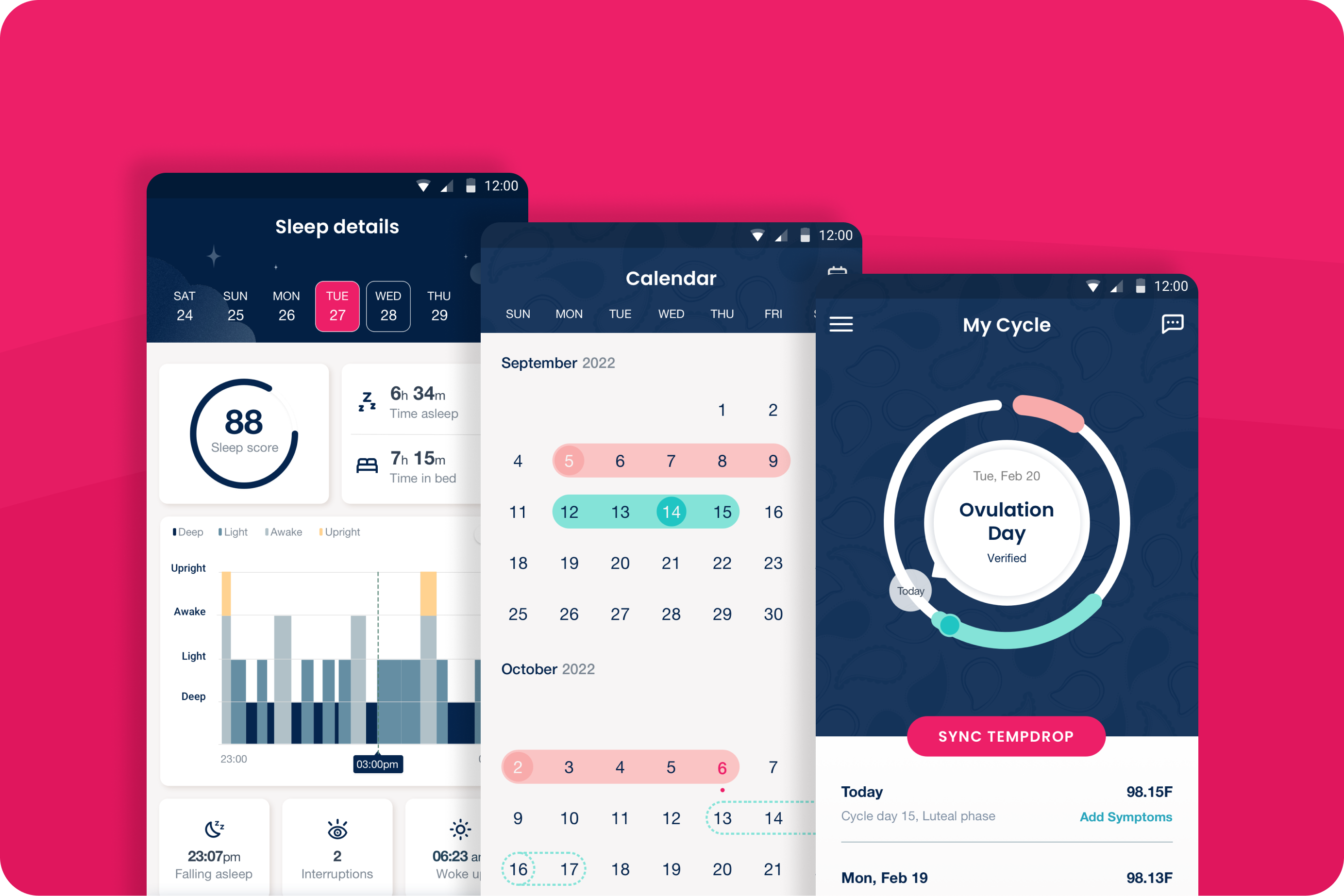
Improved Navigation
Designed a navigation bar to streamline user orientation, making it easier to locate and access key features within the app
Refined Pop-Up Experience
Revamped pop-up behavior to offer clearer, less intrusive interactions, enhancing user experience
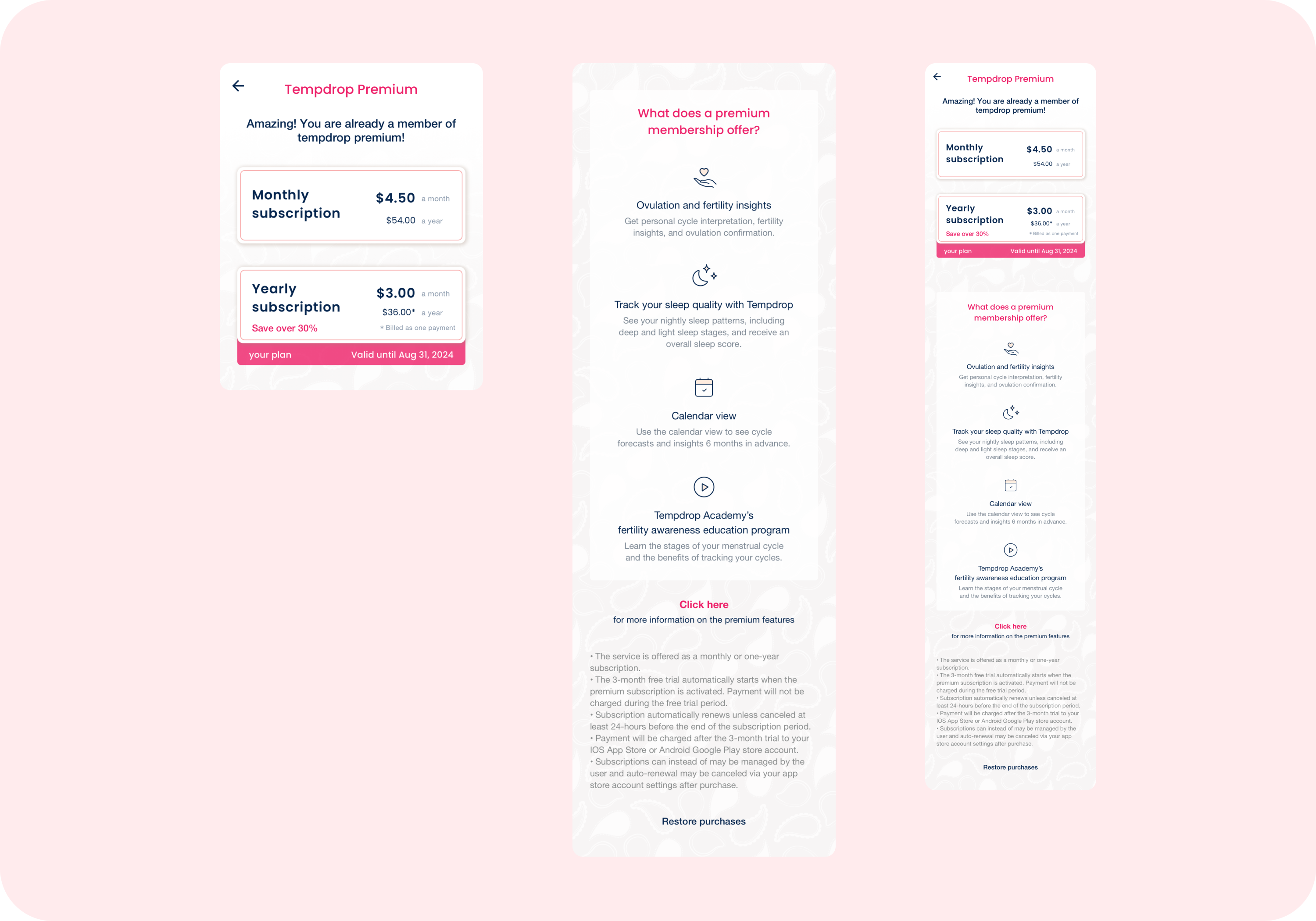
Subscription Plans
Designed the visual presentation of subscription plans to clearly differentiate between options and enhance user understanding. The design focuses on making it easy for users to identify and choose the plan that best suits their needs
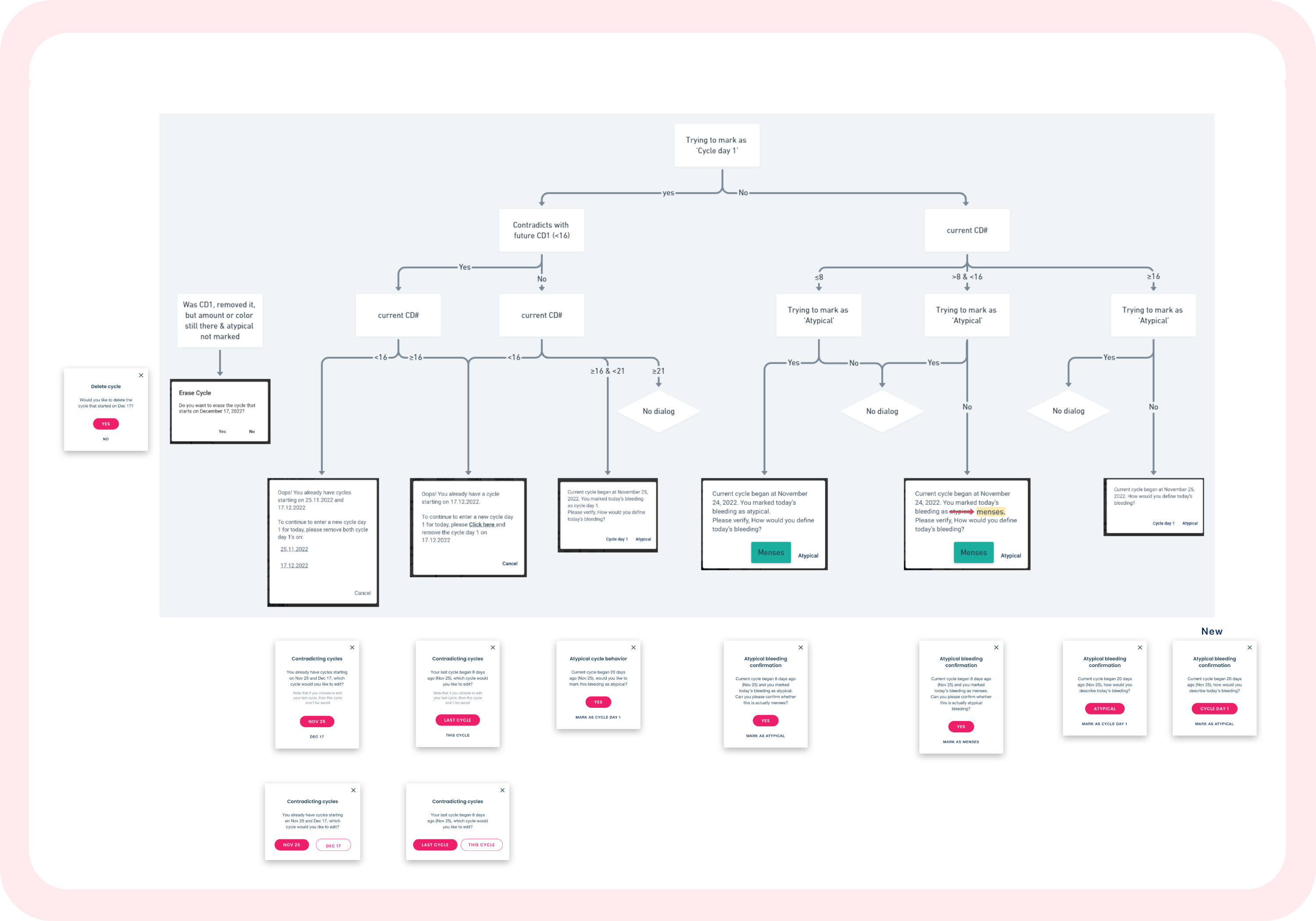
Designed and Structured
Symptom Behavior
Structured and refined the behavior of symptom tracking within the app to ensure a clear, user-friendly interface. This redesign aims to enhance how symptoms are recorded and displayed, providing users with a more intuitive and effective way to manage and monitor their health data
App in Action
Demonstrating the Value of Structured Design
Our project highlighted the importance of well-structured design, leading the company to hire an in-house designer with our guidance
Explore More Projects
Check out other projects that reflect my design work and impact